


The key to craft unforgettable user experiences lies in creating a harmonious balance between aesthetics and usability. But how does one achieve this elusive equilibrium, you may ask? Well, the answer lies in a set of sacred principles known as the 10 Basic Laws of UX. At Bhoos Games, we use these laws and weave them into our brainstorming and design processes. We try to transform our creations from mere visuals into immersive experiences through that process.
1. Aesthetic - Usability Effect
The Aesthetic-usability effect suggests that users may perceive designs that are visually appealing as more usable, which can lead to a positive reaction in their minds. This means that users may be more forgiving of small usability problems. At Bhoos, we've incorporated this concept in the Marriage Card Game by creating an aesthetically pleasing interface that captures the beauty of nature with sky, clouds, and trees. This not only creates a positive emotional response but also enhances usability.However, attractive designs may also hide usability issues, which can make it difficult to detect problems during usability testing.

2. Fitts’s Law
Fitts’s law states that the time it takes to select a target is dependent on its size and distance. Therefore, touch targets in a user interface should be adequately sized, spaced apart, and located in easily accessible areas to ensure accurate selection. We can see Fitts’ law demonstrated in the CallBreak table. The cards are placed in the bottom of the screen so that it is convenient for the players to throw the cards during gameplay.

3. Hick’s Law
Hick’s law states, when there are numerous and complex options to choose from, decision-making time increases. To reduce decision-making time, choices should be limited, and complex tasks should be divided into smaller, more manageable steps. Highlighting recommended options and using progressive onboarding can also help reduce cognitive load for users. However, it is important not to oversimplify the options to the point of abstraction. We can see the use of Hick's Law, while users choose the chips they want to bid in the Marriage Card Game by Bhoos.

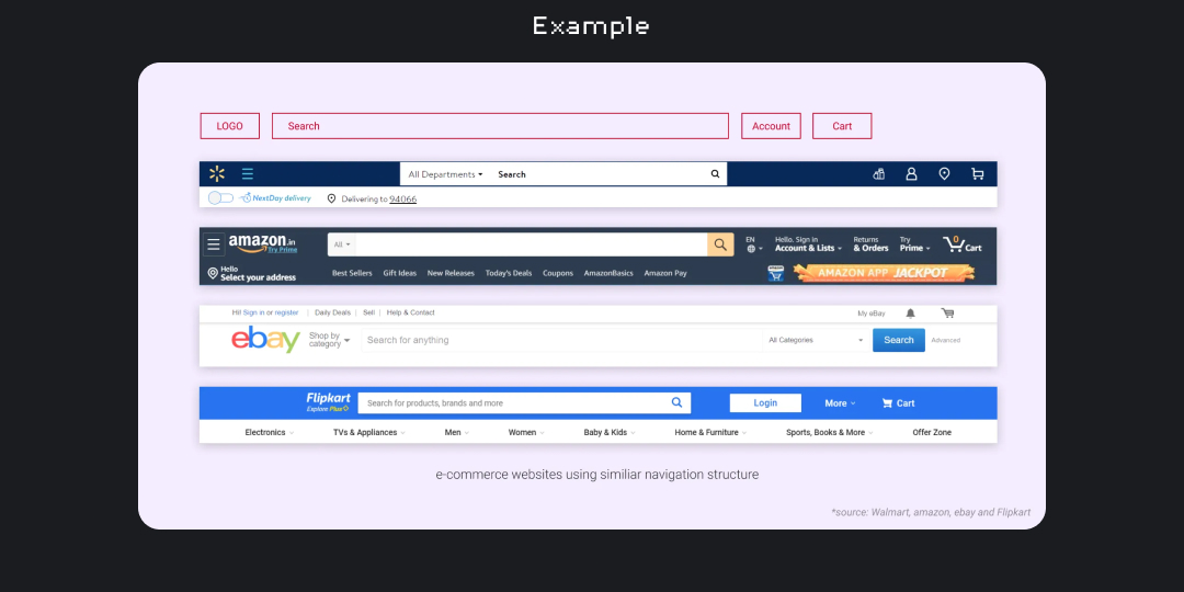
4. Jakob’s Law
Since users spend most of their time on other sites, they tend to prefer websites that function similarly to the ones they already know. This means that users will transfer their expectations and mental models from familiar products to new ones that appear similar. By leveraging existing mental models, we can create superior user experiences that allow users to focus on their tasks without having to learn new models. When making changes, it's important to minimize discord by allowing users to continue using a familiar version for a limited time.
5. Law of Common Region
When elements share an area with a clearly defined boundary, they tend to be perceived as a group. This is called a common region, which creates a clear structure and helps users understand the relationship between elements and sections. Adding a border or defining a background around an element or group of elements is an easy way to create a common region. We can see the in the following picture, the use of law of common region.

6. Law of Proximity
Objects that are close to each other tend to be perceived as a group. This is called proximity, which helps establish a relationship between nearby objects and makes it easier for users to understand and organize information efficiently. Elements in close proximity are perceived to share similar functionality or traits, aiding users in quickly understanding their relationship.

7. Law of Prägnanz
When presented with ambiguous or complex images, people tend to interpret them as the simplest form possible to reduce cognitive effort. The human eye naturally seeks simplicity and order to prevent information overload. Studies have shown that people process and remember simple figures better than complex ones. The eye simplifies complex shapes by transforming them into a single, unified shape.

8. Law of Similarity
The human eye tends to perceive visually similar elements in a design as a complete picture, shape, or group, even if those elements are separated. This means that elements with similar color, shape, size, orientation, or movement will be perceived as related and likely share a common meaning or functionality. To avoid confusion, it's important to ensure that links and navigation systems are visually differentiated from normal text elements.

9. Von-Restorff Effect
The Von-Restorff effect suggests that the item that differs from the rest is most likely to be remembered. To make important information or key actions stand out, use visual distinctions. However, be careful not to create confusion or competition among visual elements. Additionally, it's important to ensure that users with color vision deficiency or low vision are not excluded by relying solely on color for contrast.

10. Peak-End Rule
People tend to judge an experience based on how they felt at its peak and at its end, rather than the total sum or average of every moment. To create a positive user experience, it's important to pay close attention to the most intense points and the final moments of the user journey. Design to delight the end user by identifying the moments when your product is most helpful, valuable, or entertaining. It's also important to remember that negative experiences are more memorable than positive ones.
